jan-pan bakery
November 2025
Branding, design, photography and content creation
@janpanbakery
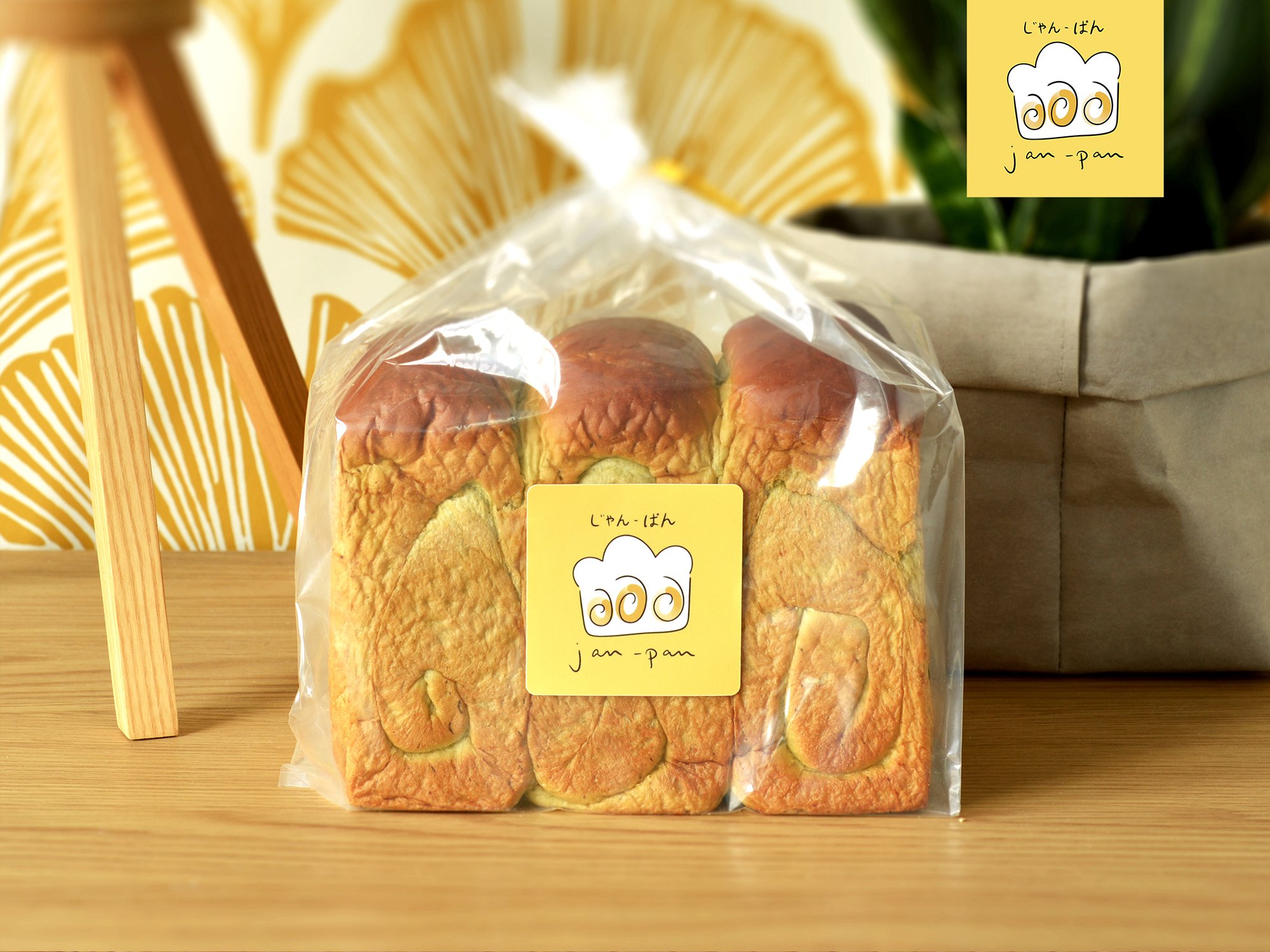
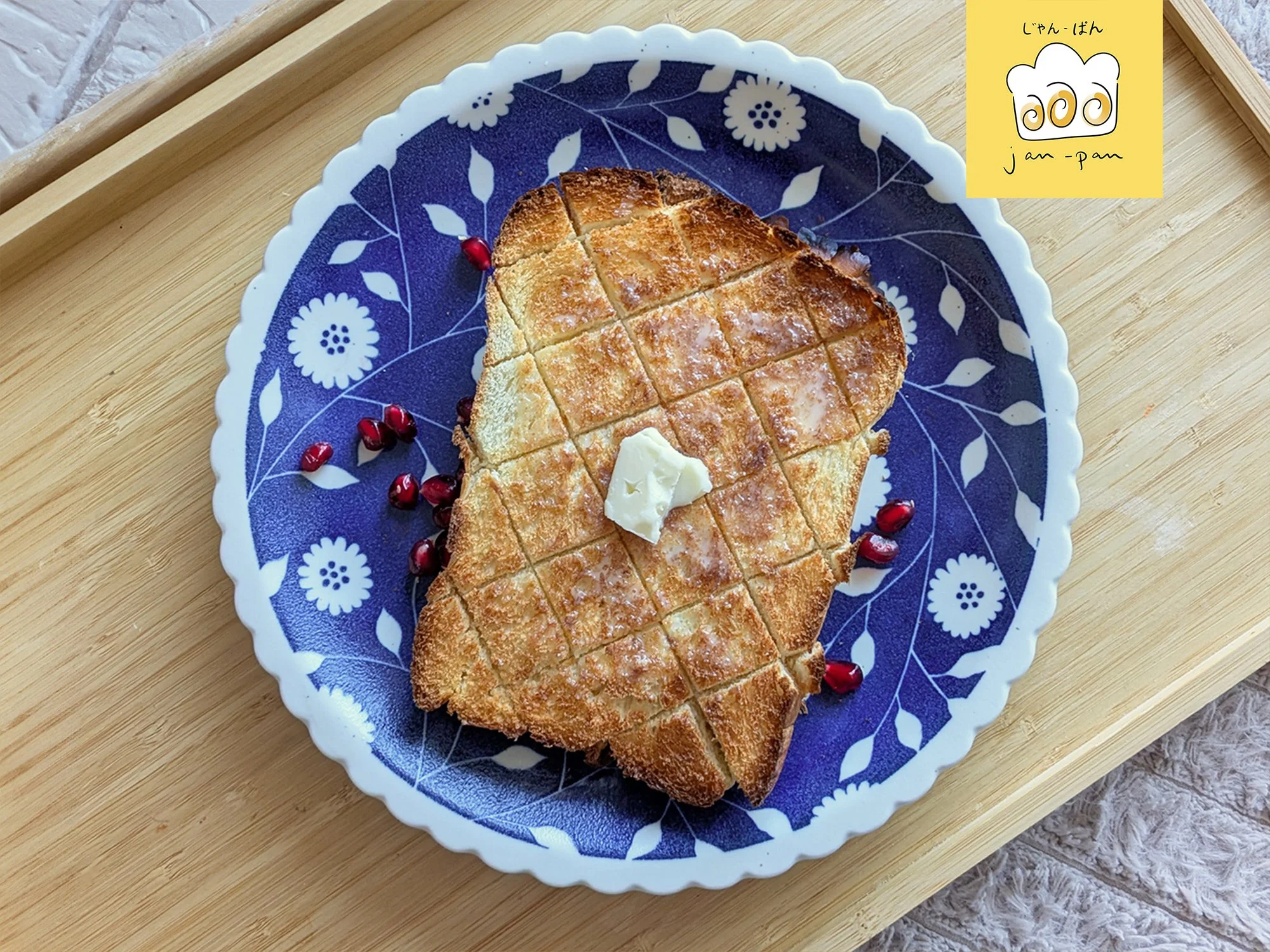
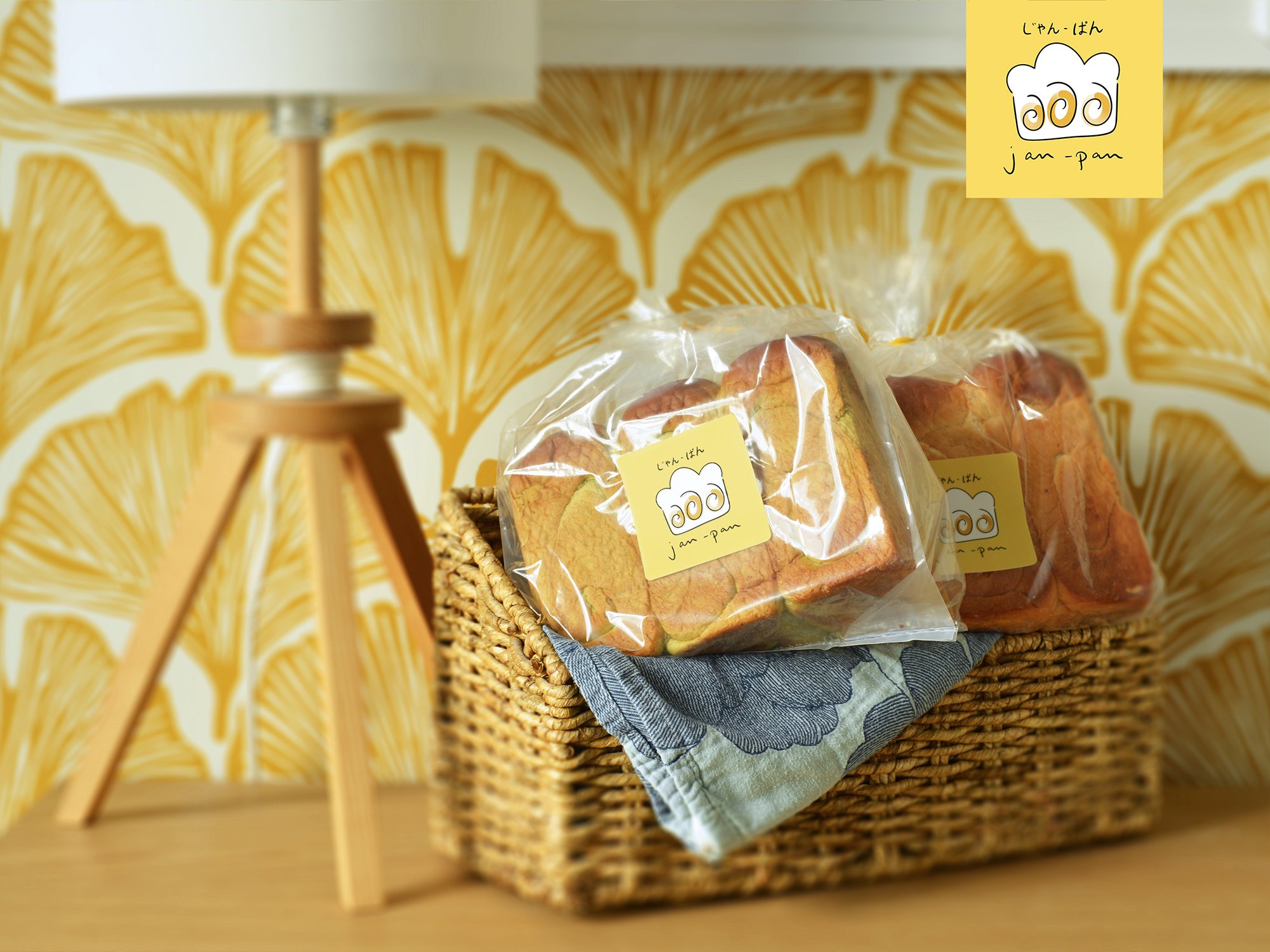
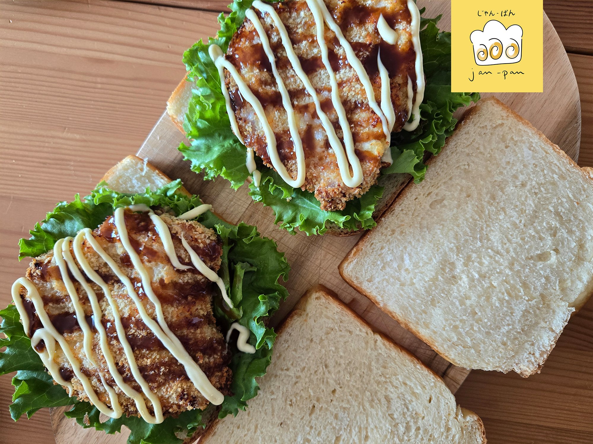
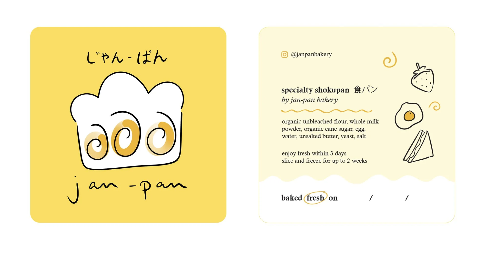
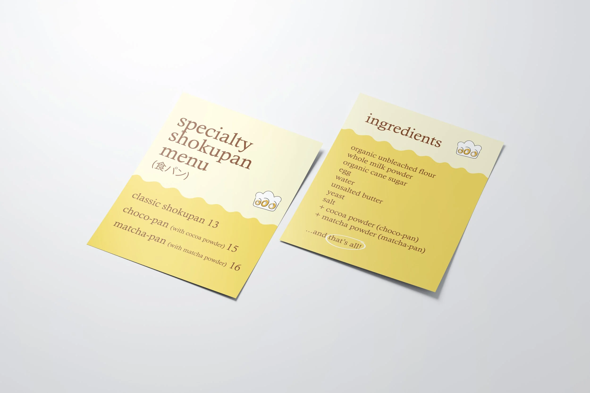
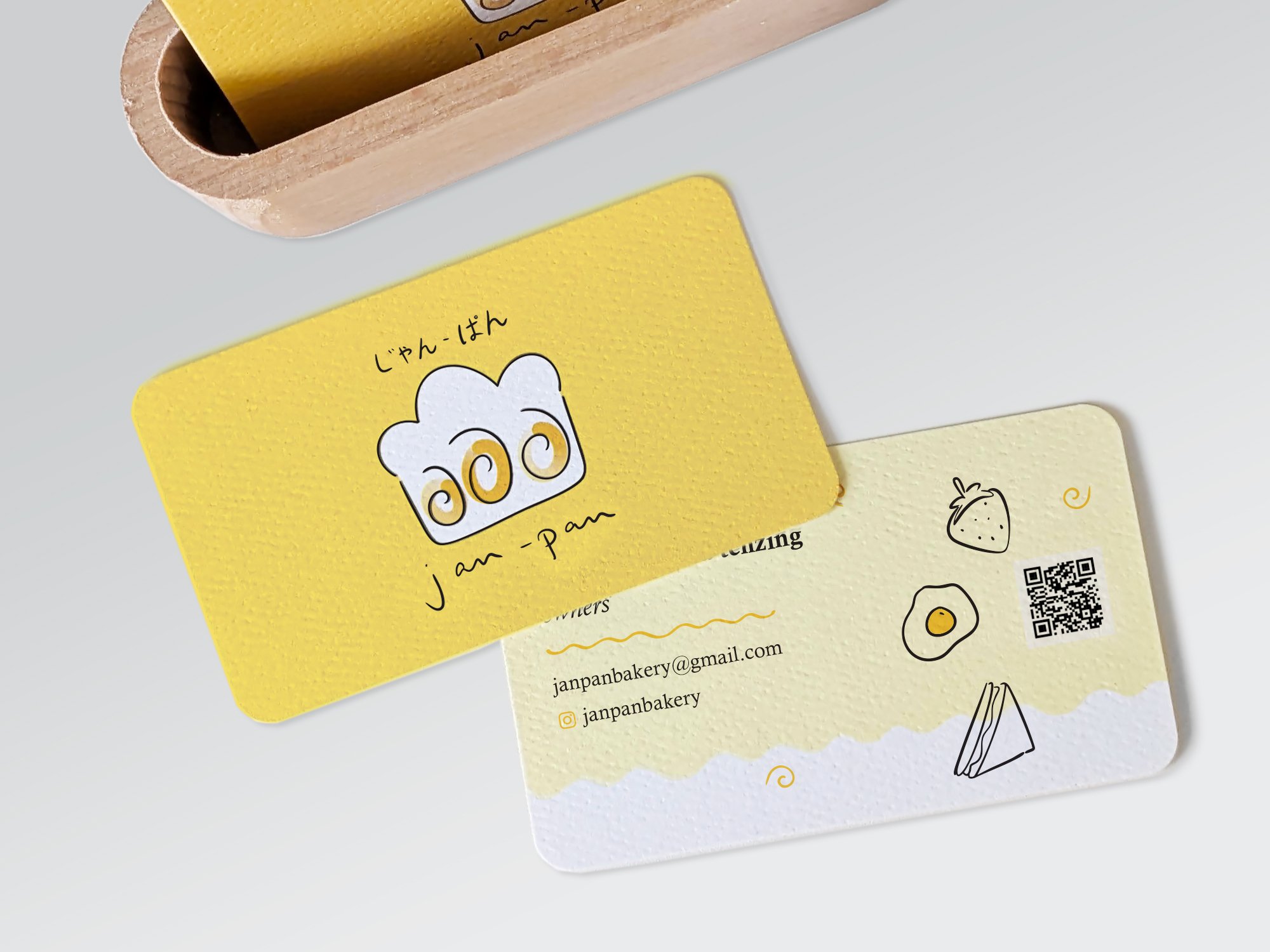
Originally born out of a dash of curiosity, our specialty shokupan evolved from a simple hobby to a personal family project. The product was a classic, home-baked Japanese milk bread, and the intention was to encompass that cozy, homemade feeling. This came down to all aspects of the branding - logo, colour palette, photography and packaging.
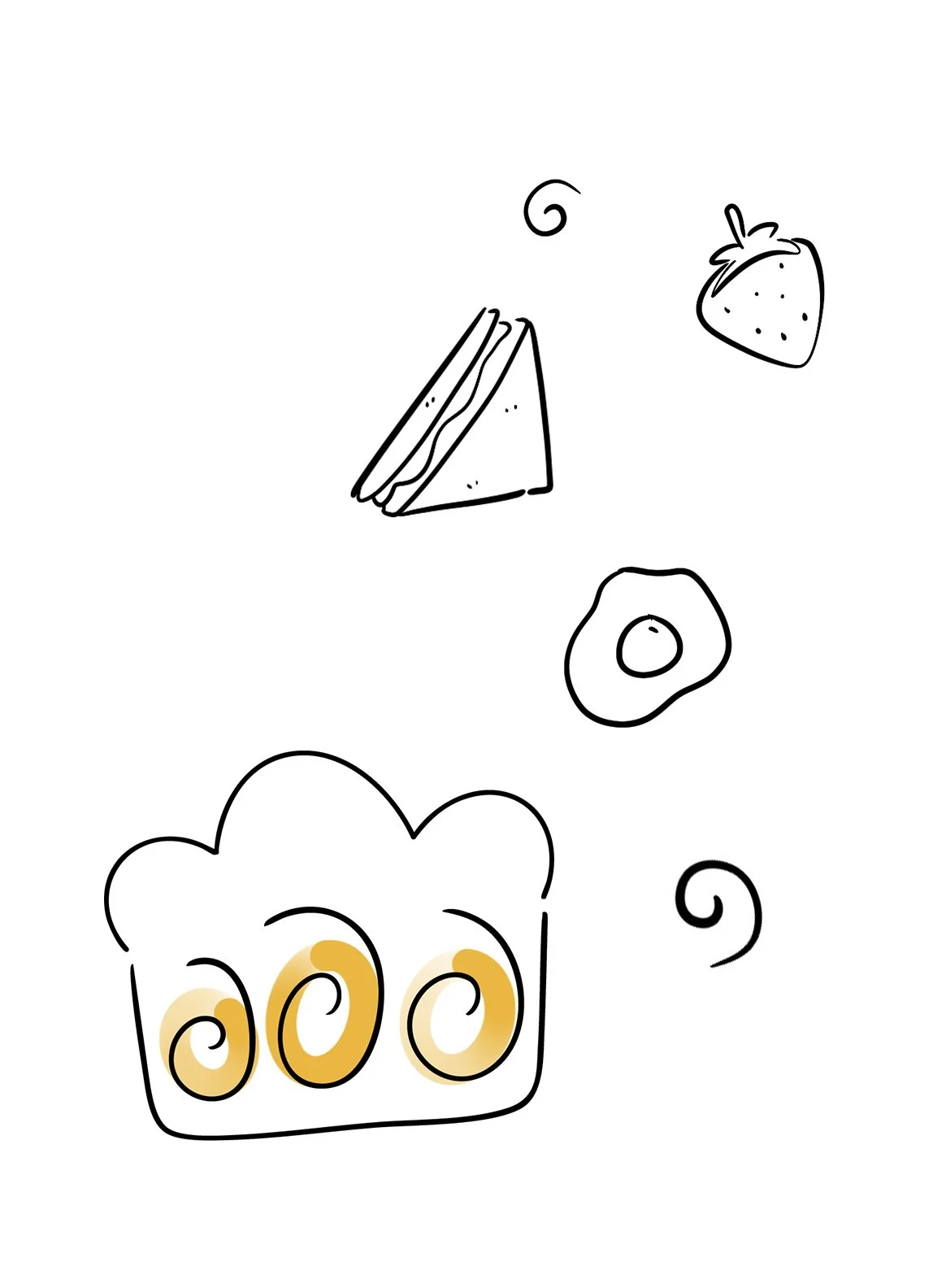
Focusing on the shape of the product itself, the logo centred on the main characteristics of the loaf, something that you notice on first glance: 3 iconic swirls. From there, we find the connection to the hand-drawn illustrations and graphics to tie together additional collateral. Colours were kept simple but unique and complimentary to the individual flavours, and photography focused on tidiness, but not perfection. Similar elements were used throughout the packaging, to videos, to business cards and social media presence.